SRS Language Learning App
Note: pictures can be clicked to bring up lightbox
Link to the site: https://srs-app-tony.fly.dev/
Existing language learning apps are often great for bringing you to a basic level of understanding, but true mastery of a language requires drilling vocabulary. In the past, this was a tedious process that often required manual input, hunting down example sentences, or trying to find all the phrases and variations of a particular word (with all the problems that come with that).
Today, with the help of AI, one can improve this process by having an SRS (spaced repetition system) with automatic card generation that pairs with your existing texts through an organized interface.
I’ll start by talking about the general overall structure, setup, and UX in comparison to existing apps. Then, for each page, I’ll go into the decisions and notable or interesting behavior.
I’ve already gone over the backend decisions in another post. This article will be purely focused on the frontend aspects of the SRS project.
Overview
Your typical SRS app does not include automatic card generation. Creating cards is a tedious, manual process that involves typing in each front/back side.
In addition, one typically encounters words or phrases while reading new texts. It’s somewhat hard to get the words to type in. There are frequency lists, but these exist out of context. Having the context in which you first encounter a word makes adding it to your deck easier and more memorable.
I divide the app into several pages/routes on the sidenav. We have:
- Review
- Search
- Texts
- Add Words
- Settings
Tech Stack & Design Decisions
- React 19
- TanStack Query
- ShadCN
- Tailwind
The main challenge here is state management. We have many reads and writes across several interconnected resources — words, decks, texts, use cases, SRS state — each with their own lifecycle and update patterns.
The API follows REST closely, and this app is a good example of why that matters. REST works cleanest when your domain maps naturally to resources: nouns you create, read, update, and delete. Here, the core data model is exactly that. GET /words, POST /words, PATCH /words/:id, DELETE /words/:id — the operations map without contortion. Many apps end up doing what you might call “JSON-RPC in disguise”: endpoints like POST /processText or POST /runReview that are really commands, not resource operations. REST bends awkwardly there, because you’re describing actions rather than things. This app does have some of that — canonicalization, AI generation, SRS interval calculation — but those are supporting operations, not the core of the API. The primary data model is clean enough that REST carries most of the weight.
TanStack Query is the right tool here because the majority of the app’s state is server state — words, decks, SRS schedules, uploaded texts. We want a loop between updating server state and the local state updating accordingly. TanStack Query also provides other niceties like loading states, error states, cache invalidation, and refetching. The endpoints are not always reliable, especially when dealing with AI calls, so it’s crucial to have these safeguards built-in.
I chose Shadcn and Tailwind here, but with caution. I do know that eventually, the adoption of a complex table component, or other such complex components (like typeahead) will be required. At that point, I’d likely reach for headless versions like TanStack table, or Downshift. Shadcn works well for now, because I have my own clear idea of what the styling choices should be, and having this, I can be more confident in creating my own design system from scratch.
Buttons are designed with functionality and contrast in mind. The “theme color” is purple. Cancel or delete buttons have a customary red theme. There is a slight physical press-down animation upon click.
That being said, I do realize that as of this writing, Shadcn’s accessibility is not as good as that of MUI.
Pages
We have our “Texts” page. It’s divided into two parts, the left for perusing previews of each text through a search interface, and the right for viewing the full text with the ability to see and create highlights for particular phrases or words.
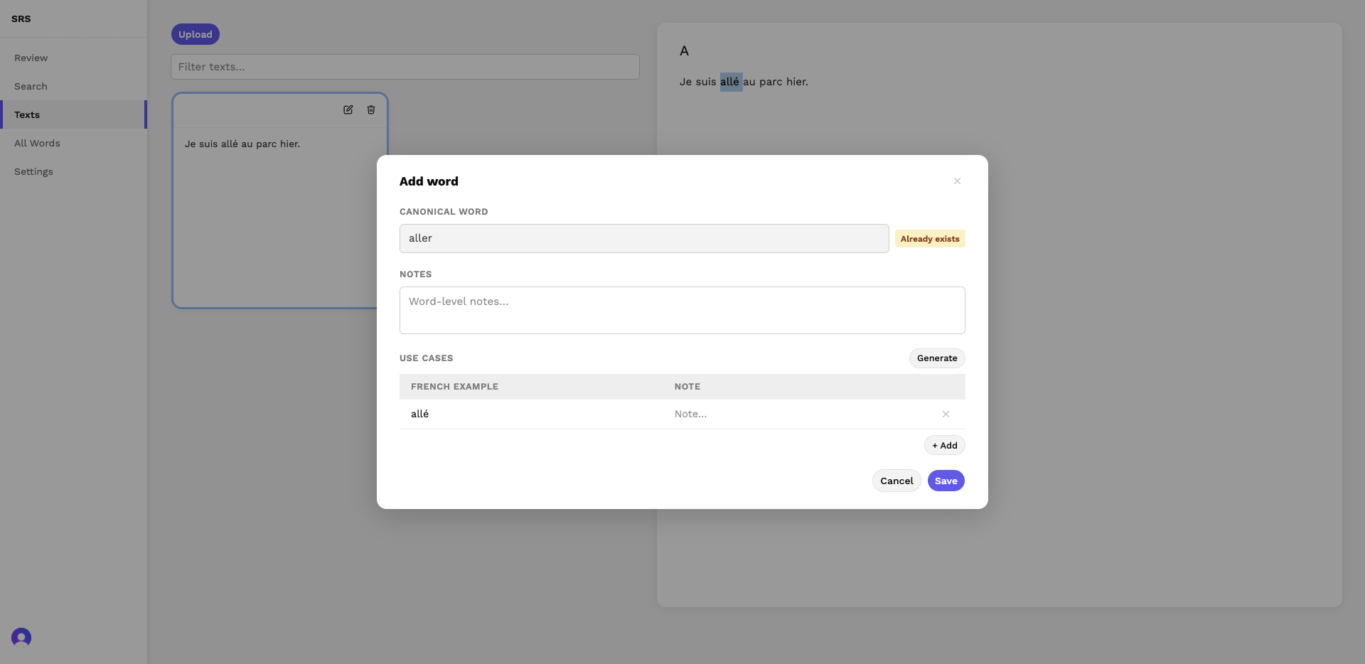
There are 2 modals. First is the create/edit text modal, which can be accessed via either the upload button or by clicking a particular preview card. Second is the Add Word modal, which can be accessed via highlighting a word on the right side and clicking the tooltip button that pops up. The Add Word modal needs to be robust: it should behave differently for words that already exist in the deck. Modal design on this page is predicated on the idea that there will be multiple paths of entry into each modal, each of which will entail different behavior. The Add Word modal also takes in “additional notes” that will be displayed while reviewing, after a card has been flipped.
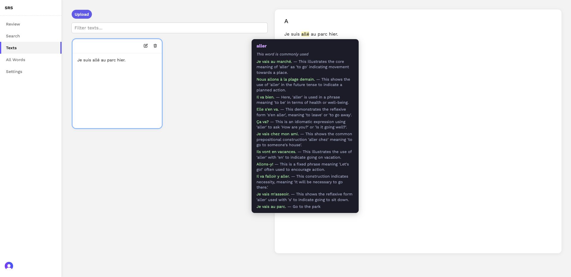
To use the Texts page, upload any plain text — an article, a book chapter, a transcript — and the app renders it with your known vocabulary highlighted inline. Clicking a highlighted word shows its definition and example sentences. Selecting any unfamiliar word adds it to your deck, with AI-generated example sentences attached automatically (but you can choose to delete, edit, and create your own example sentences; user always has the ability to override the AI).
There’s many different moving pieces of state here. We have our texts, which can be filtered. We have the search query. We have the words that already exist in the deck. We have the highlight previews, and the tooltip previews. Upon creation of a new word card, we need to refresh our state from the backend, to reflect the latest words.
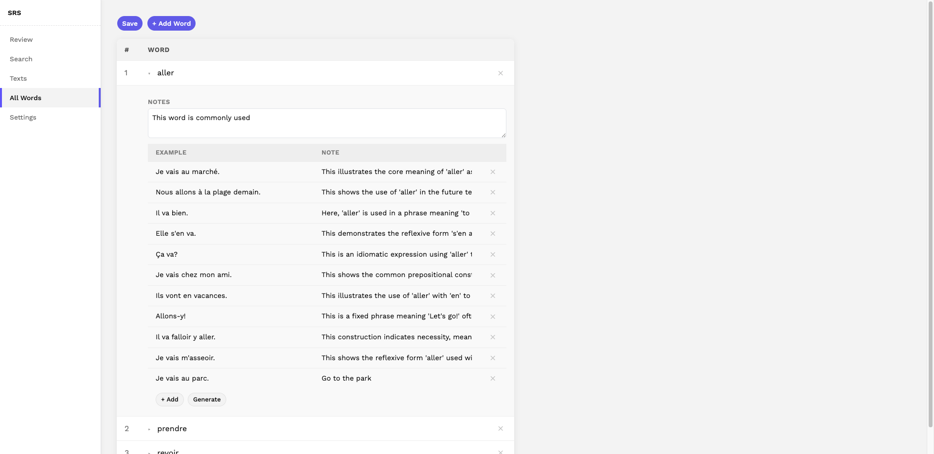
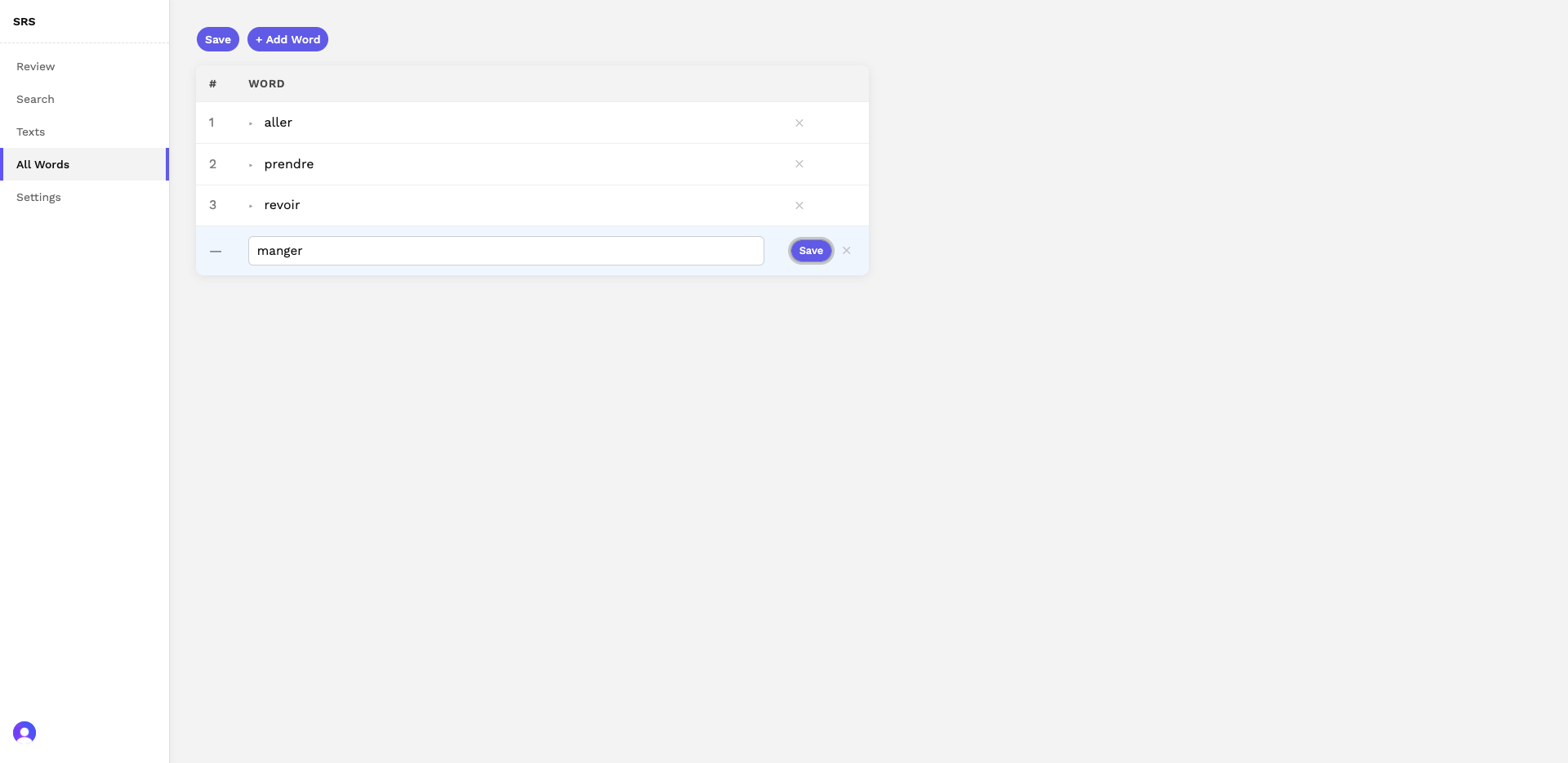
Next we have our “All Words” page. This is a table with expanding elements, editable, and new row functionality. This includes all the functionality of the Add Words modal, except in a table format. Rows are expandable. Upon expansion of a row (which represents a word), user will see the different use cases, which they can edit and delete. There’s an Add button and a Generate button, for adding a new use case sub-row and generating use cases automatically.
I chose an expansion based table UI for the particular reason of a user wanting to quickly glean the use cases of several words at once. The table UI allows the user to do this with less friction than say, an alternative like a modal. In cases like these, I know no UI is perfect, but the goal is to choose the option that creates the least friction.
Upon creating a new row for a word, users can click “save” to save the row, which is necessarily before one can add use cases.
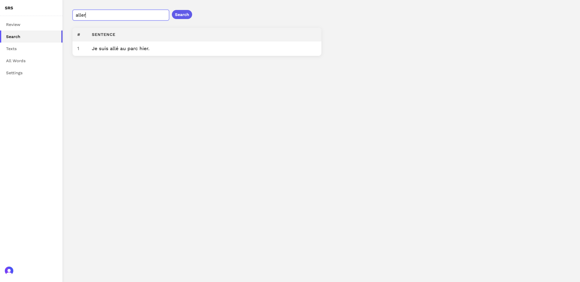
We have a search page. This page allows the user to search for words in the existing texts. It can break down by sentence, so you don’t end up seeing the entire text for just one word. It can handle variations, as you can see in the screenshot below. “Aller” will be recognized in the form “allé” in the texts.
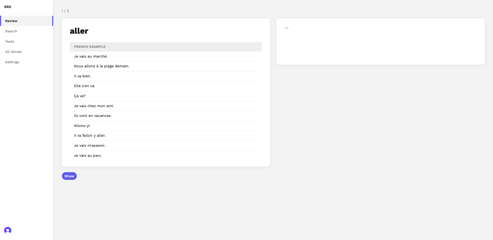
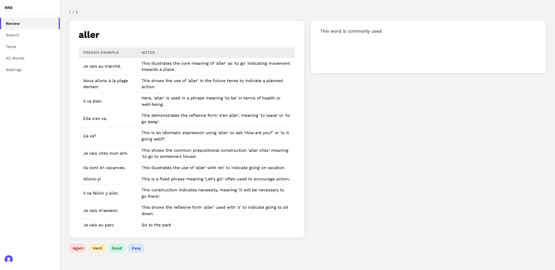
Our actual review page is fairly standard. On the left, we have our word and table. On the right, we display the “additional notes” when the Show button is clicked. We have the standard rating system, color coded by difficulty.