Ironworks Register Design Study
Tony Jiang · · 5 min read · permalink
Goals
I wanted to test out my design skills. I had some ideas lingering on the back of my mind for a while, and with the advancements in latest tools, wanted to see if I could flesh them out, and by what means I could do so.
Initial inspiration
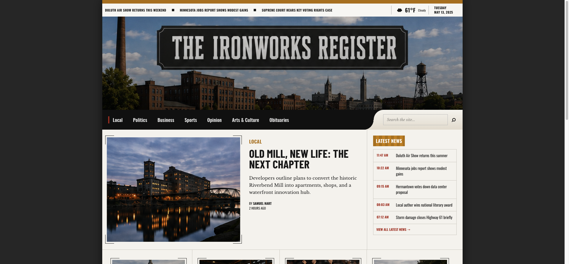
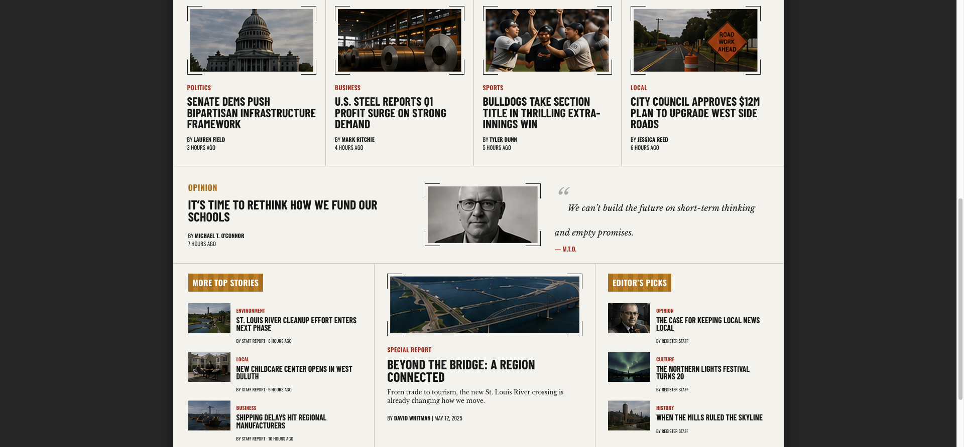
I’ve always appreciated skeuomorphic design — the stitched leather, the brushed metal, the paper grain that dominated interfaces in the early 2010s before flat design swept it all away. I thought a newspaper would be a good place to demonstrate this. So when I set out to design the Ironworks Register, a newspaper-style layout with an industrial-town theme, I gave myself a specific constraint: bring skeuomorphism back, but don’t just copy-paste 2012.
I also wanted to add animations, like the hover animation, so it doesn’t look completely old.
The problem with nostalgia
It’s easy to romanticize that era of design. Real textures, tactile shadows, interfaces that looked like objects. But it also had real problems: visual noise, small fonts, compact spacing, no animations. If I was going to revive it, I couldn’t just revive all of it.
So the actual design question wasn’t “how do I make this look like 2012?” It was: what did that era get right, what did it get wrong, and what has design gotten right since that I don’t want to throw away? That framing — keep the good of the past, keep the good of the present, drop the rest — ended up being the real spine of the project, more than any specific visual choice.
Starting with the building blocks
Rather than jumping into layout, I started with three foundational decisions: theme, typography, and color palette.
The theme (an American industrial town) gave me a coherent world to pull details from: ironwork, rivets, aged paper, the kind of newspaper you’d imagine coming out of a 19th-century mill town but somehow still functional as a modern reading interface.
Typography and palette came next, before layout, because everything downstream depends on them. Get those two wrong and no amount of layout polish saves the piece; get them right and the layout decisions almost make themselves. That order, (theme, then type and color, finally structure) is something I’d stick to again. It’s tempting to jump straight to laying things out because it feels like “real progress,” but the building blocks have to be settled first or you end up redoing structural work later.
Then, I thought about what needed to be present in a page. I wanted things like a newswire, weather status, date, categories, and a search bar, in addition to the stories (around which I’ve placed frames).
I wanted the layout to be centered and constrained width, as opposed to the wide layouts common now. I found the old layouts to be easier to read, as the compressed margins and padding often meant that you could see the same amount of content on the same screen compared to the excessively spaced content common now.
I wanted to instill some feelings in the reader, which I think is the hardest thing for the AI to do. Initially, the AI simply generated a plain navbar. I wanted the navbar to exist inside the image, but on top of a shadow. I also wanted to search bar to jut out - breaking visual boundaries is an important part of that earlier aesthetic, and it also happened matched the feeling I wanted to convey. The holistic feeling generated by both the search bar and the categories navbar, with the selected city photo, is hard to describe, but it conveys a kind of “homeyness”.
“Latest News” looks like a billboard almost, like some kind of high school announcement. Here I’m relying on certain associations.
The bar decoration for the backgrounds are designed to evoke a sense of industrial physical presence.
For interactions like hovering over a preview image, an animation will appear of the image getting bigger to fit its frame. This is an important detail to make it feel “modern”; using the latest technology is not incompatible with “older” motifs.
The tool chain: ChatGPT, v0, Claude Code
For execution, I split the work across three tools, each doing one job:
- ChatGPT (image generation) for visual exploration — getting a look and feel down fast without committing to code.
- v0 for turning an image into an actual coded page.
- Claude Code for going in afterward and fixing/refining the code.
The big lesson here: don’t try to do everything in one tool. When I split the work into steps and handed off each step to a specialized tool, the result was dramatically faster and better than forcing one tool do everything.
v0 vs. Claude Code for image-to-code
One comparison worth calling out: I tried both v0 and Claude Code for converting an image mockup into code, and v0 was faster and better, by a clear margin.
That might be due to how each tool behaved rather than a hard capability gap. Claude Code was actually writing out full components — a more structural, engineering-minded approach. v0 was generating a single page in a Tailwind-style utility CSS approach, which is a much lighter lift for a one-off visual translation. For “get this image into working code as fast as possible,” the single-page utility-CSS approach won.
What I’d take forward
A few things I’m carrying into the next project:
Frame the aesthetic as a question, not a reference. “What did the past get right and wrong, and what do I keep from now?” produced better decisions than “make it look like X year.”
Sequence the fundamentals before the layout. Theme → typography → color → structure kept me from having to redo work.
Match the tool to the stage, not the whole project to one tool. Image generation, image-to-code, and code refinement are different jobs. Trying to do them all in one place cost more time than switching between specialized tools.
Pick your image-to-code tool based on what you actually need. If it’s a fast, single-page translation, v0’s utility-CSS approach is hard to beat right now. If you’re building toward a real component architecture, it’s worth testing whether Claude Code’s more structural output pays off despite the slower start.